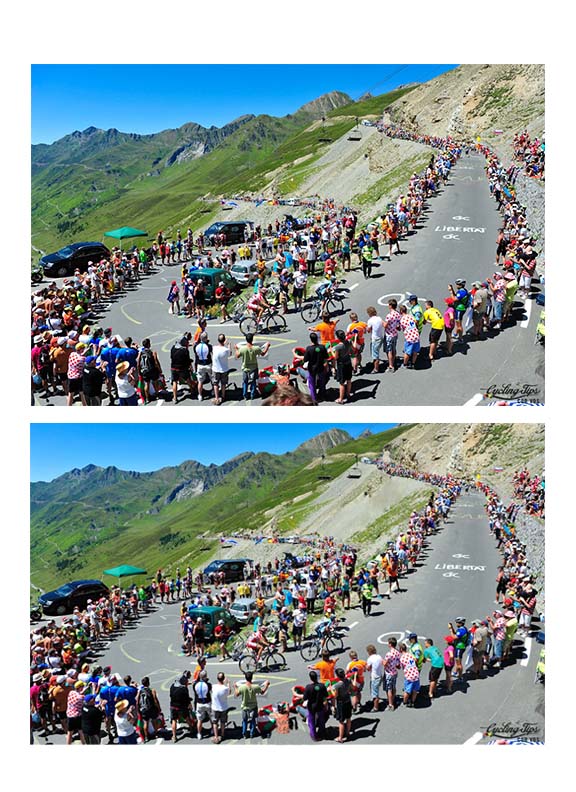
 A project we did during our Photo Manipulation unit. 5 differences per image, original is on top. Can you spot them all???
0 Comments
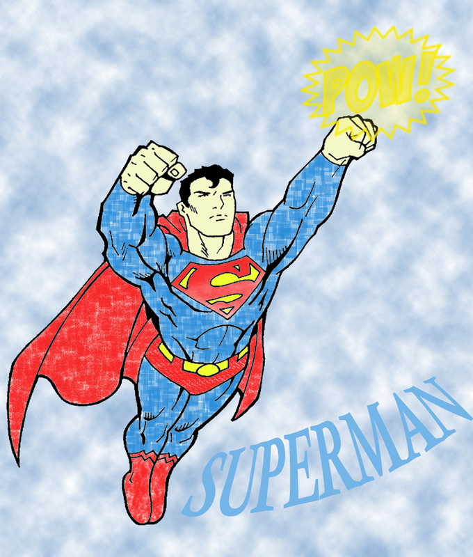 Fun coloring project using multiple layers and stamp tool in Photoshop.
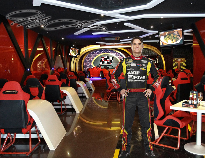 This was a piece of my final project, which was to create a whole promotional set for a restaurant. My restaurant, The Finish Line, was based around a race car theme which obviously had to feature Jeff Gordon! Logo is featured in the back along with Gordon's signature in the top left corner.
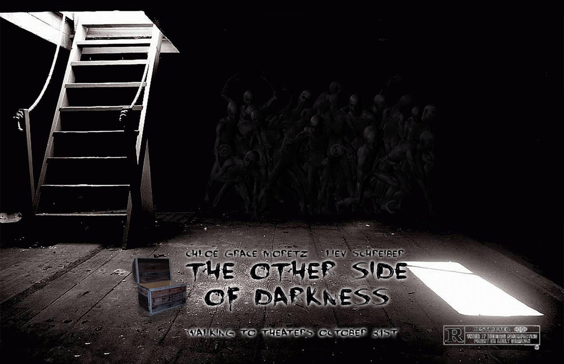 When I was given the movie title, I immediately thought of a scary movie. I messed around with the opacity of the zombie image in the background to make it subtle but noticeable. I used an outer glow effect on the text so it could really pop off the page. When printed, the brightness of the poster slightly decreased and gave it that ghoul like look I was aiming for.
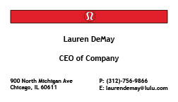 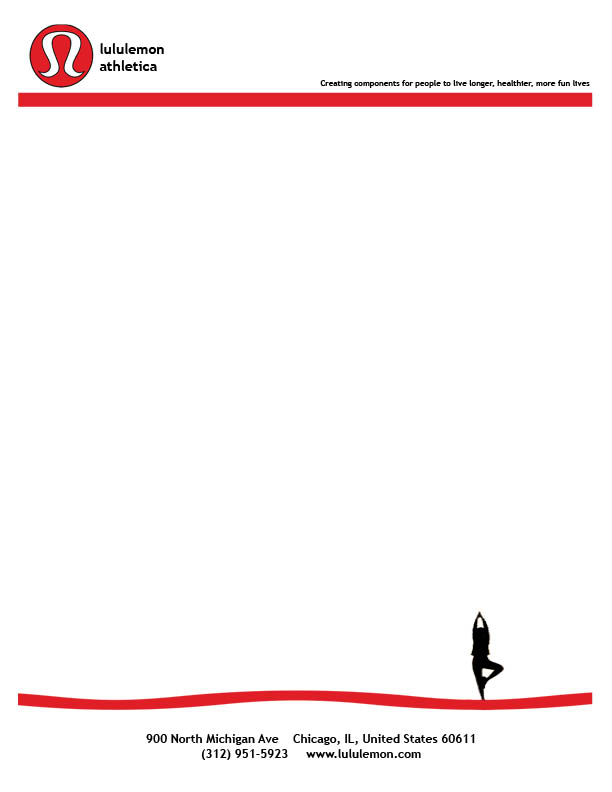 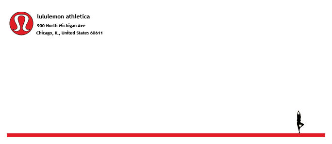 I chose to make a business set for lululemon (yes, it is lowercase), a yoga wear company with stores across the Chicagoland area. With the logo being a significant part of the company's merchandise, I chose to incorporate it into the set to create an awareness of what the company is. I added the red stripe throughout the set to keep the negative space balanced and not have too much of it. The little shadow in tree pose is another way of telling the viewer what the company makes, which is yoga wear. The common color scheme of the company is red, white, and black which are the colors of the set. The black and red eliminate any extra negative space that is needed.
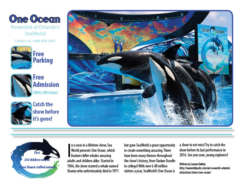 For the project, I thought it would be a great idea to feature the killer whale show One Ocean at SeaWorld since it has been all over the news lately. I tried to keep the color scheme nice and related to the focus image of the four whales in the right hand corner. The light blue creates a good contrast with the darker blue and makes the black text stand out even more. I put a black stroke around the words One Ocean to make that part of the text really stand out to the viewer. I tried to keep the description of the show to a minimum but it was difficult since the show is very popular and many want to know more about it! The text is arranged into columns to keep the negative space there and to create an easy flow for the eyes. I kept everything off of the margins on the sides since it gives the nice negative space there and also since the printer would cut off information if I didn't :). After the peer review, I added some contact information since I was missing it and also added borders around the pictures since they were just floating in space on the page. The borders add contrast to the page and make the poster grab attention of whoever walks past it.
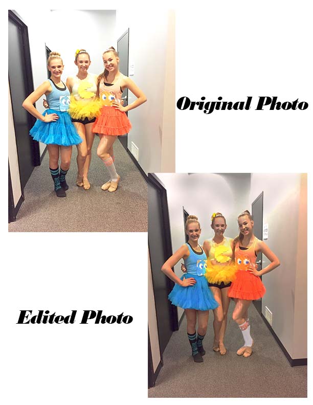 In my photo surgery, I used multiple tools to help fix the brightness and weird things in the image. I used the Spot Healing Brush tool to fix up the bruised legs, the shininess of our faces/arms, and on specific parts of the floor. I used the Clone stamp tool a TON to fix the carpet and make sure it matched up with the lighting. I used the sponge tool to bring out the color in our costumes as well as the vibrance tool. I messed with the Brightness/Contrast sliders to find the perfect lighting and I replaced the color in my friend Sarah's socks from grey to white. I used the burn tool to darken the background and make it seem more realistic. The image came out a little more pixelated than I would've hoped for, but altogether it came out very well! I tried to use Smart Sharpen to fix the pixelation of the image, but it ended up making the image look unrealistic and drawing-like. If I could redo this, I'd mess more with the filters to really make a difference between the two images.
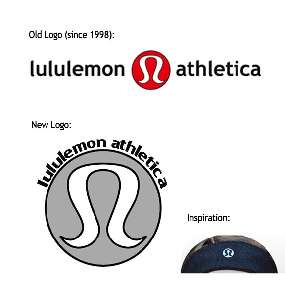 My new and improved lululemon logo will take the business to a new level in the oncoming year! I tried to stay with the basic shape of the logo, which is the fancy A with the circle around it. I changed the color from red to gray since in almost all of their products, the symbol on the merchandise is a reflective version of the logo. You can not tell in the logo displayed above, but the A in the middle of the image is meant to change to the color of whatever background it is put on (like it is on most lululemon products). The bent text above the image shows that the company is willing to bend in any direction to make their customers happy. No pun intended, since it is a company that makes yoga wear. The black with the gray and white helps to keep the contrast consistent and clean looking, and to not overwhelm the actual image. I included the inspiration for the logo change above, which is an image of the logo being used on a headband the company created. I believe the new logo will make more sense when added on clothing, and will be an image recognized internationally.
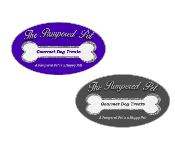 The company I chose to make a logo for was The Pampered Pet, which had an ideal color scheme of purple and silver. My target was mainly towards the group of classy pet owners who like to spoil their pets as much as possible. Since this is such a high end company making gourmet treats specifically for animals, I put a glitter outline on the bone to emphasize the fact that this is a fancy store. The cursive text adds to the fanciness, and the motto "A Pampered Pet is a Happy Pet!" encourages others to check out the new store. The gray-scale logo isn't nearly as bold as the RGB color logo, but it still gets the point across. I had a lot of comments saying I should fill in the negative space with something, but I feel it really adds simplicity to the logo so I didn't do anything to change that. I fixed the font with the text "Gourmet Dog Treats" to make it easier to read. The overall view of the logo pleases me, and I think we have a winner when it comes to the term "pamper your pets".
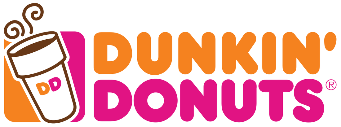 The Dunkin' Donuts logo utilizes the white (negative) space around it by using it as a secondary color to really make the lettering pop. In some cases, they shorten down the logo just to make it DD, with one D being orange and the other the bright pink, which stands out just as well as the full logo. The thick lettering helps to make the company name stand out, and the logo with the coffee cup stands out as well. To make it look good in black and white, I could change the orange to a light grey and the pink to black to make the white background still stand out. The lettering would still stand out without the colors clashing together.
|
AuthorI'm a dancer who always has a keen eye for something unique. Archives
January 2016
Categories |
 RSS Feed
